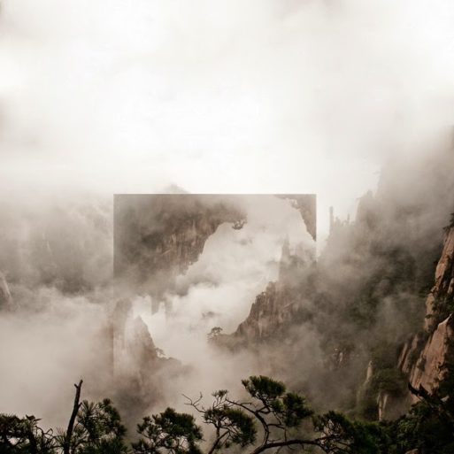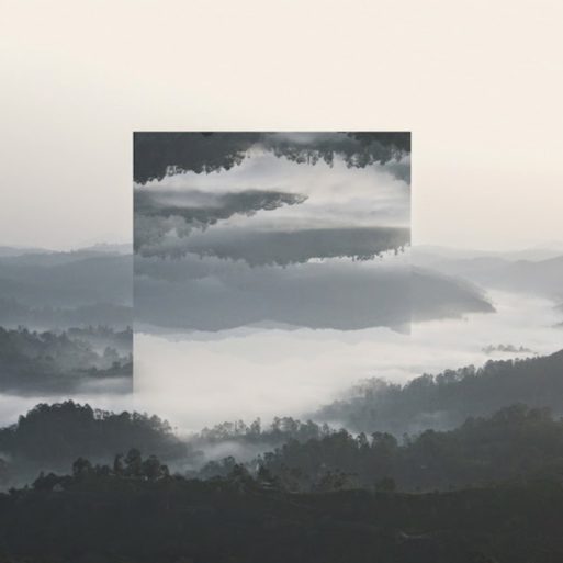
“Denial” Credit: Witchoria.com
Like the seven deadly sins, the five stages of grief have been dissected over and over by thousands of artists, each with a slightly different variation on the same theme. The problem with the five stages of grief is that most artistic renditions are straightforward and obvious. Anger is usually red, depression is usually blue and acceptance is represented by calm, beautiful images.
This is where Brooklyn graphic artist Witchoria (Victoria Siemer) stands out from the crowd. Rather than taking an obvious approach to the five stages of grief, she crafts landscape images whose meanings are far more nebulous. It’s not immediately obvious which pieces represent which stage. But that’s exactly what makes her art so appealing; it rewards you for looking into the tiny details, piecing together meaning like a puzzle.
Witchoria’s project opens with “Denial,” shown at the top of this page. It’s a chaotic image of sharp tree branches, jagged cliffs and a dense fog of clouds. In the center, she cuts and pastes another image of cliffs, forming a perfect square. All of the pieces in this series have a strong geometric element as their focal point.
“Denial” feels like the emotion. After losing someone, it’s easy to feel like you’re in a dense fog. The world appears chaotic and hostile, and everything seems to have turned upside down overnight. The line of trees in the foreground could represent the viewer shielding themselves from the outside world, seeking protection.

“Anger”
Credit: Witchoria.com
“Anger” is another unexpected image from Witchoria. While most artists go straight for bloodred, intense images, she chooses to take us to the seaside. However, although the image appears calm, when you look closely, you see tumult. Waves crash and splatter against rocks like anger boiling below the surface.

“Bargaining”
Credit: Witchoria.com
“Bargaining” is similar to “Anger” in that it doesn’t appear to represent the emotion at the surface, when in reality, it gives it a subtle nod. The lush green landscape could represent the adage “The grass is always greener on the other side.”

“Depression”
Credit: Witchoria.com
“Depression” is the only image in the series that immediately brings to mind the emotion it represents. It’s a dark, dense photo, and it’s almost impossible to tell where it is.
Unlike “Bargaining,” which is still colorful and hopeful, “Depression” is colorless, featureless and almost bland. It perfectly encapsulates the dull feeling of sadness after a loss. Everything becomes numb and joyless, yet it has a constant tinge of grief around the corners.
Finally, Witchoria helps us arrive at “Acceptance.” The colors are slightly more vibrant, although they still have a dark quality around the edges. She zooms out from the bland density of “Depression” to show her audience that the world is expansive and detailed once more. There’s still the dense trees of “Denial” and the waters of “Anger” when you look closely. But all of these elements are now working together to form a larger image. It represents the realization that all of these emotions are still present, but they no longer encompass her entire world view. She sees the world as whole again. The grief is still there, but now it’s one small piece of a much larger puzzle.

“Acceptance”
Credit: Witchoria.com
For more information on Victoria Siemer, visit her Witchoria gallery.

 The Five Stages of Grief, Turned Upside Down


 Final Messages of the Dying
 Will I Die in Pain?


