 Andy Warhol’s “Death and Disaster” Series
Andy Warhol is without a doubt one of the more popular and well-known 20th century artists. Most people associate Warhol with his repetitive, advertisement-based art such as the “Campbell’s Soup Cans” piece.
Warhol frequently employed the use of repetition to drive home a particular idea. He used this technique with a wide variety of subjects, and it worked particularly well with some of his more famous works that are a part of his “Death and Disaster” series.
The “Death and Disaster” series is a group of around 70 loosely-connected works that included images culled from newspapers and police reports depicting car accidents, electric chairs, suicides, plane crashes, etc.
Credit: sothebys.com
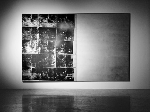
One of the most well-known pieces from this series is called “Silver Car Crash (Double Disaster).” Warhol created the piece using a silkscreen to repeat images of a car crash scene across the canvas, and the photo used depicts a twisted body strewn across the car’s interior. The repeated images are situated next to a blank silver canvas, which creates a sense of emptiness, perhaps representing the empty feeling one may experience when confronting images related to death.
The repeated images (all black and silver) of the crash all differ slightly in their degree of darkness; some are much lighter than others, and you can see the entire image. A few of the images are almost completely black, obscuring the brutal scene.
The work is quite large, measuring 8-feet tall and 13-feet wide. Warhol created “Silver Car Crash” in 1963, and it is actually the highest grossing Warhol painting to date, having sold for $105 million in 2013.
“Silver Car Crash (Double Disaster)” also has a cinematic feel to it; the use of silver and black makes it look like a filmstrip. Perhaps Warhol wanted us to think of it in that sense — that the media oftentimes portrays disasters as a form of entertainment.
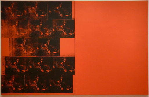
Another large-scale, silkscreen painting that is part of the “Death and Disaster” series is called “Orange Car Crash 14 Times.” In similar fashion as the aforementioned “Silver Car Crash,” “Orange Car Crash 14 Times” included two canvases. The one on the left has the 14 images of a deadly car crash, and the right side is simply a blank canvas.
Credit: Gwen Fran via Flickr
Both sides are a vibrant orange. Warhol frequently used vibrant colors in his paintings, and his use of a warm orange color to highlight the darkness of the subject matter is interesting.
The color and repetition of the image combine to lessen the intensity of the photo. This is surely one of the ideas Warhol was trying to convey: Our frequent exposure to disasters and death in the media seem to lessen our feelings of empathy. The repetition distances us from the intensity and seriousness of the topic.
Repetition and Desensitization
With his “Death and Disaster” series, Andy Warhol wanted us to think about death and how it is portrayed to us via contemporary media outlets. Of course, he created many of his silkscreen paintings in the 1960s, when newspapers were still the main source of news. Television news was coming into its own, but papers were still the main “news.”
It’s all changed quite a bit since then. Now social media and online outlets are the main ways that many people see the news of the day.
Most of the works from the “Death and Disaster” series were made with materials culled from newspaper headlines. Though the sources have changed, the message is still relevant today: Repeated themes and over-saturation can cause us to become numb to the gravity of death and disasters.

Credit: tate.org.uk
People dying is covered so prominently in the media that we are all inured to it. So on a grand scale, when we read headlines and stories about disasters halfway across the world, we’re shocked and horrified. But we often move on to the next thing quickly without really taking the time to think about the devastation.
I think that Warhol wanted to make that notion evident to his audience. If we saw simply the one image centered on a huge canvas, perhaps it would seem more shocking than 14 copies in succession. And with his use of strong colors in many of the paintings, a sense of beauty comes along with the images of brutality.
The “Death and Disaster” series is a thought-provoking look into the nature of media and how we’re constantly bombarded with stories and headlines about death. Being far removed from these situations, we become desensitized to it all, which can make the deaths of people who are close to us and important in our lives even more painful when those times come.


 “Hand to Earth” by Andy Goldsworthy
 Trans Remembrance Project Provides a Community of Grieving
 Caring for a Dying Loved One? Be Gentle With Yourself.