Credit: OMGEVING
In the past, a crematorium had one simple purpose: to cremate the dead. Today, many families now gather in these spaces to remember loved ones. But most crematoriums still lack bold decor or elaborate architecture. They’re not the warmest, friendliest places to visit. Often, they’re just basic buildings designed to be as unobtrusive and utilitarian as possible. But Hofheide Crematorium in Holsbeek, Belgium breaks this stereotype.
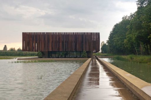
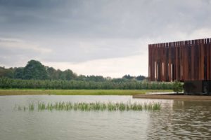
The Hofheide Crematorium is a sleek, modern, artistic piece of architecture that isn’t afraid to be eye-catching. The subcontractor group who made Hofheide Crematorium, OMGEVING, crafted intricate metal plates all along the sides of the structure that tilt at varying angles. From a distance, the metal pieces almost look like reeds sticking out of the shallow water basin below.

Credit: OMGEVING
As a result of their unique tilt, the sun hits these metal “reeds” at different angles throughout the day, creating a new line of shadows each hour. When you visit Hofheide Crematorium in the early morning, you’ll see what appears to be an entirely different building than the one you see in the evening. The moving shadows represent the changes that we go through as we move from life to death. And they highlight the fact that we can find beauty in every stage of life, including our twilight hours.
A Place for Contemplation
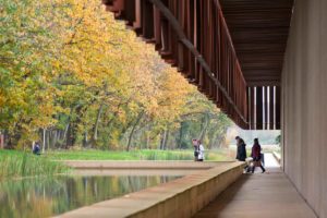
The building evokes a sense of calm contemplation in its visitors, which derives in part from of the contrast between wild, ethereal nature and cold, hard industrialism. The building sits at the end of a gorgeous nature park, surrounded by the still waters of the swamp basin below. The architects carefully rusted each one of the steel reeds so that they blend seamlessly into the earthy environment around the building. They also used deep brown stone in the building itself to tie the structure into the background.
All of this careful planning gives Hofheide Crematorium a meditative feel, which the architects continue on the inside of the crematorium. There you’ll see moving shadows that come from strategically placed skylights and window openings. The seating is simple and deep brown (almost black), once again blending into the rest of the structure.

Credit: OMGEVING
You won’t find elaborate flower arrangements or lacy details inside. The designers maintained a clean, uncluttered atmosphere in every room. This reserved minimalism keeps the crematorium non-denominational, allowing families to bring their own religious beliefs, or lack thereof, into the space. And it also promotes deep thought. As you walk through the space, your mind isn’t distracted by artwork or elaborate decorations; it has room to wander.
The two groups who designed the concept behind Hofheide Crematorium (RCR Aranda Pigem Vilalta S.P and COUSSÉE & GORIS) earned multiple awards for their work, including the sought-after Pritzker prize. And it’s easy to understand why. The crematorium is one of the best examples of the latest trend in artistic funeral spaces. The architects who designed the Hofheide Crematorium and others like them are changing the way we think about funerals and cremation. Perhaps they will also help shape a more modern attitude toward death and dying in our society one day.

 Hofheide Crematorium Uses Shadow to Create A Work of Art


 Final Messages of the Dying
 Will I Die in Pain?


